Fancy Face Rose Room
The past summer I had an amazing opportunity. I was contacted by the owner of Fancy Face to design their first storefront! I was so excited to be apart of such a special project. Since Valentines day is just around the corner and this room is elegant, pretty pink and romantic I decided to share some before and after photos of the space, some of my sketches behind the scenes photos we took along the way!
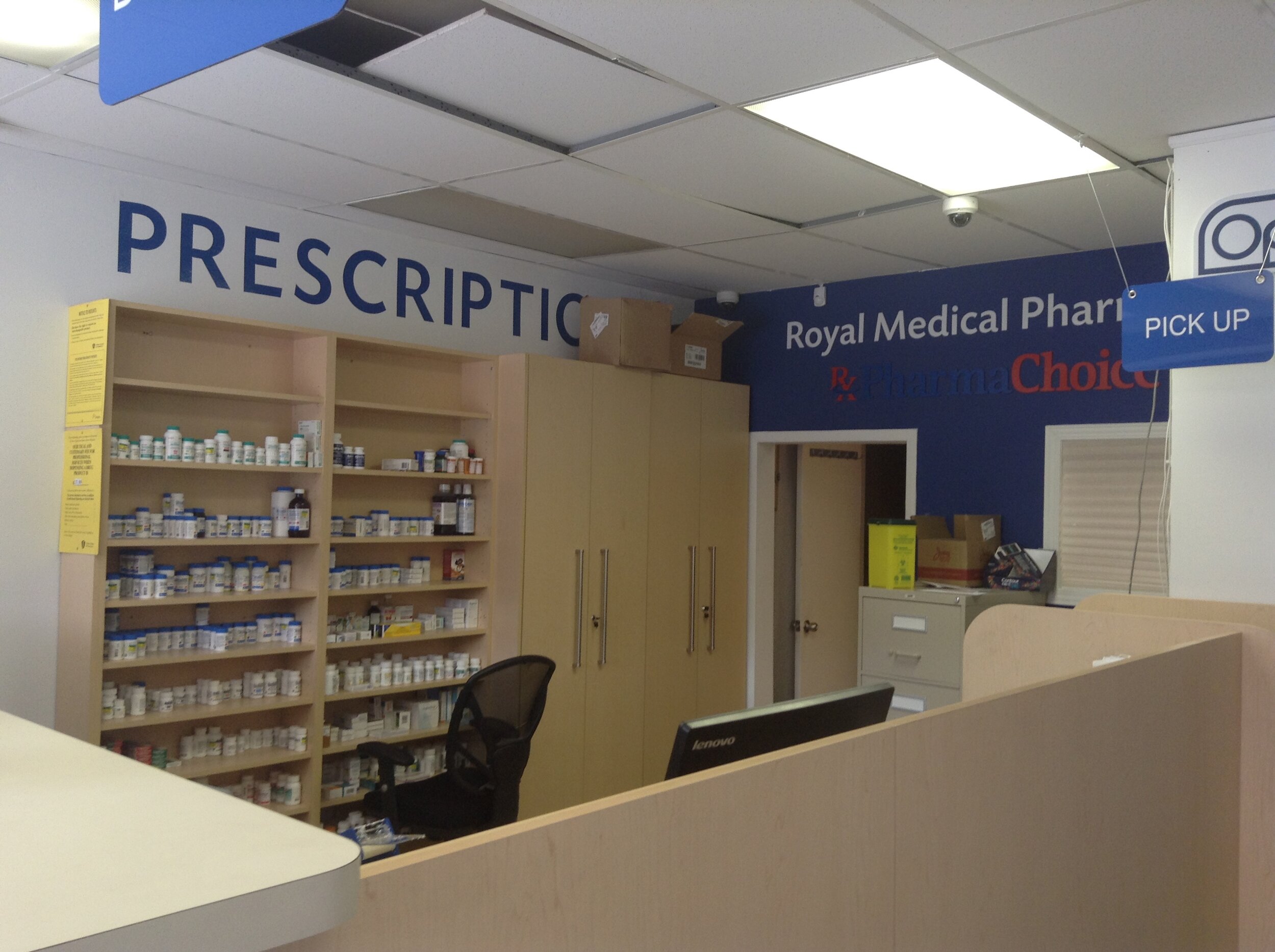
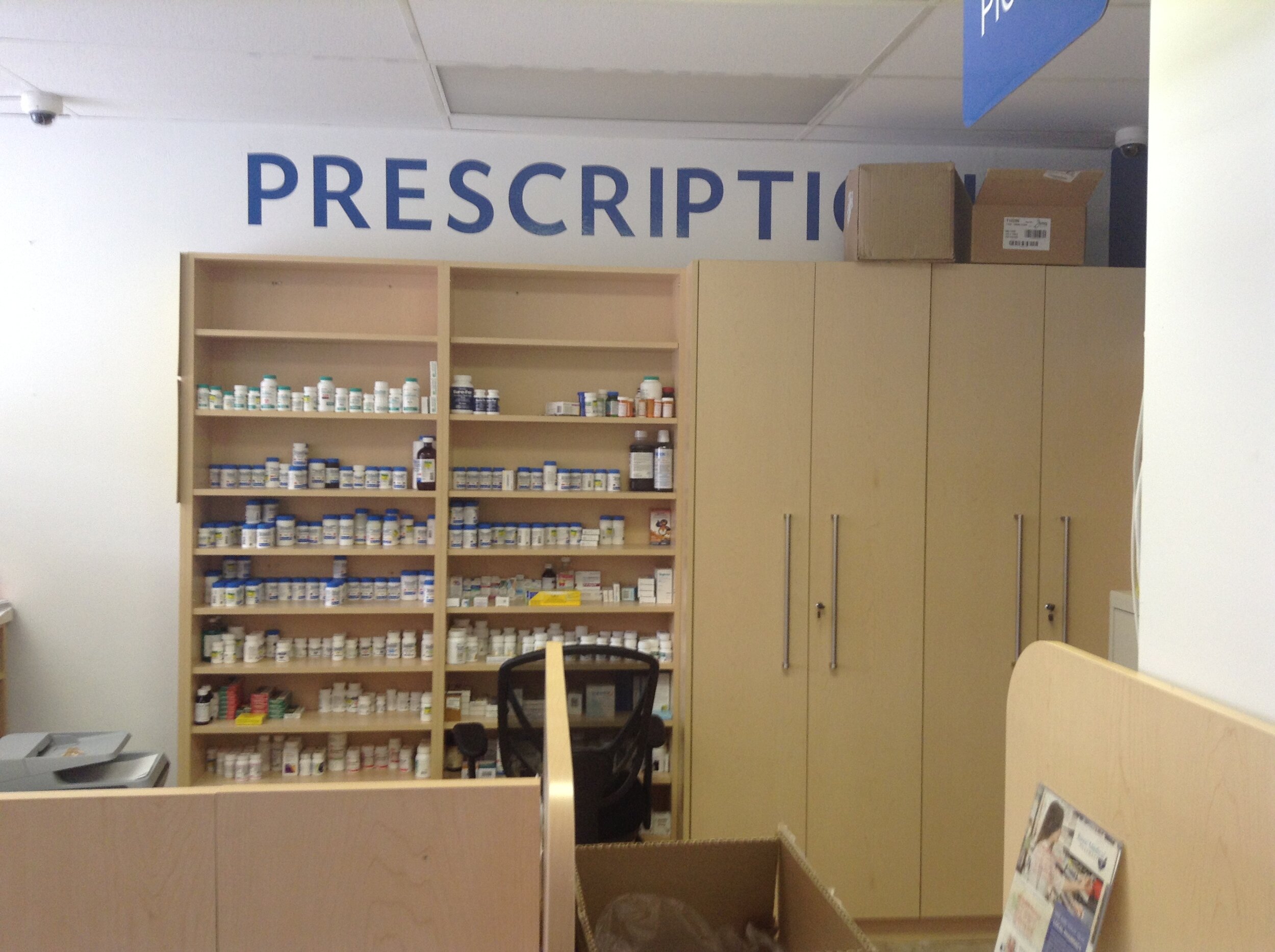
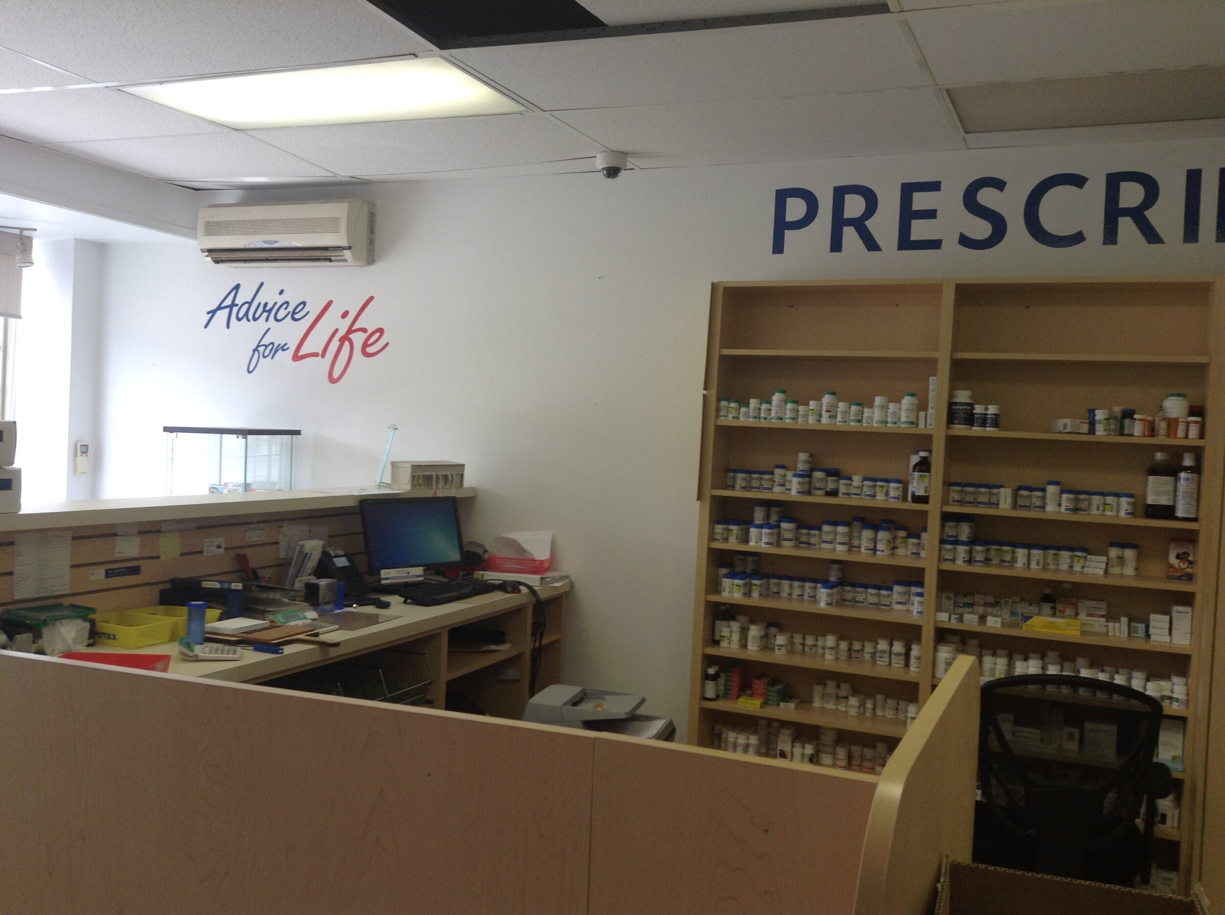
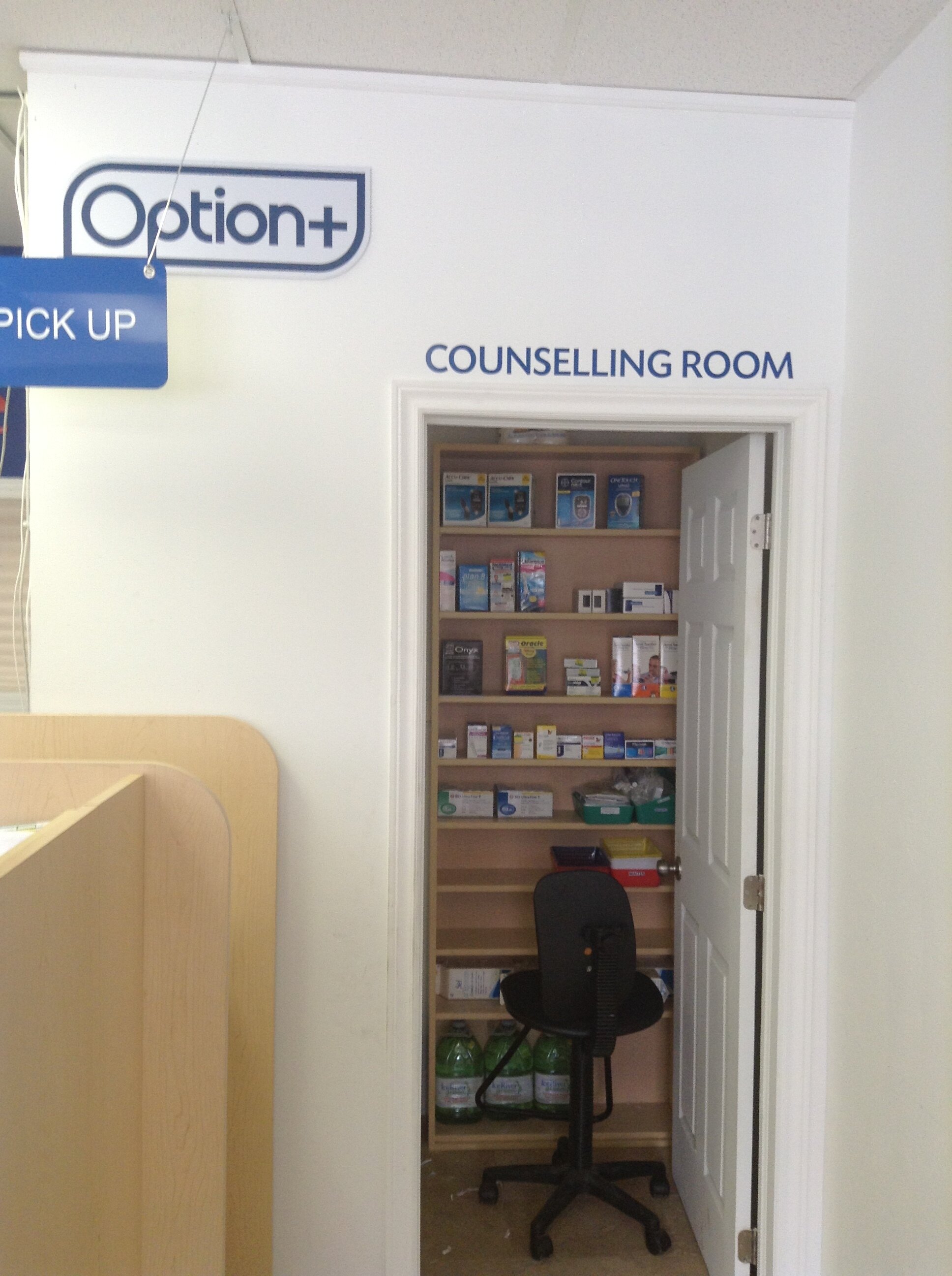
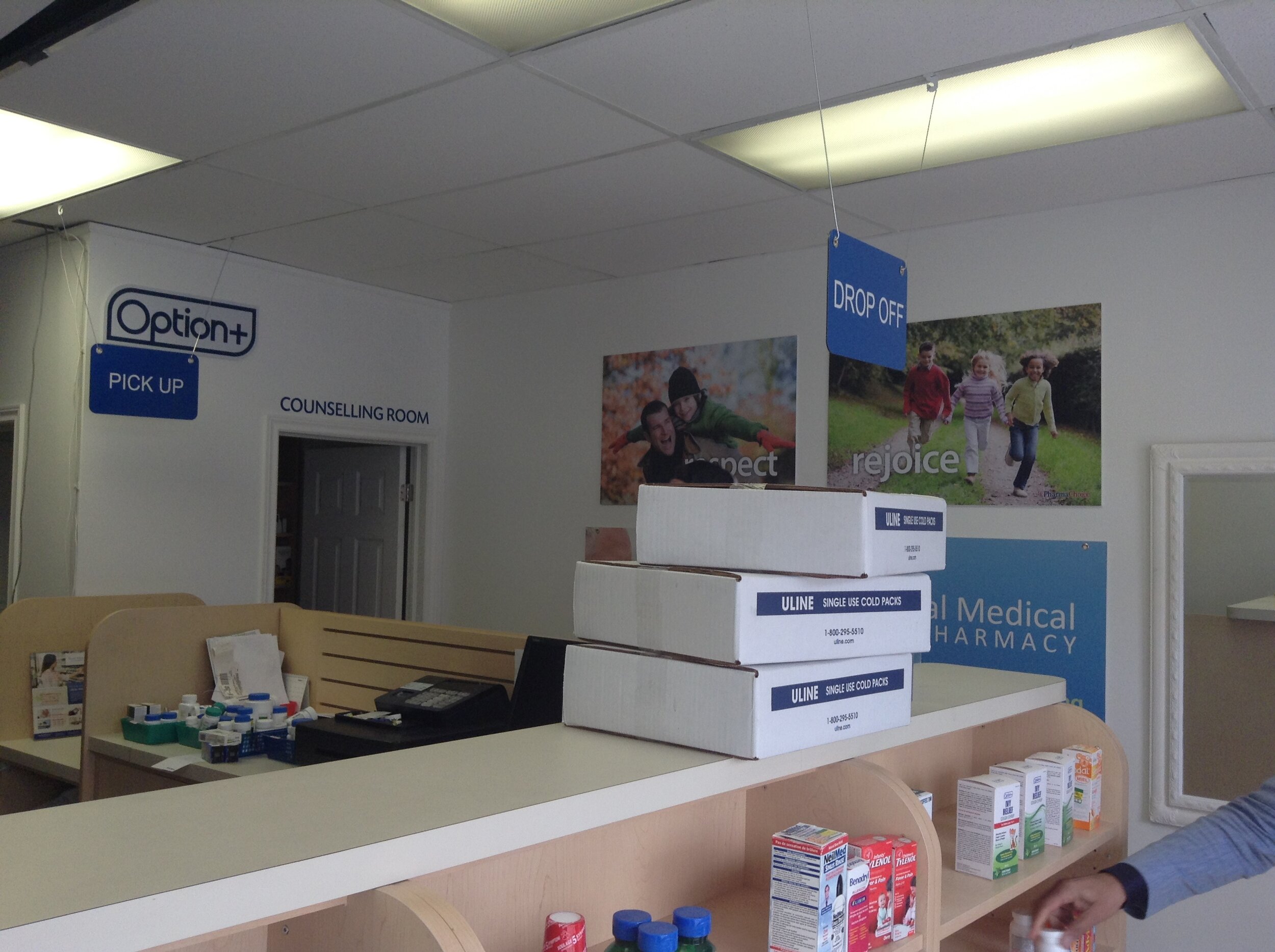
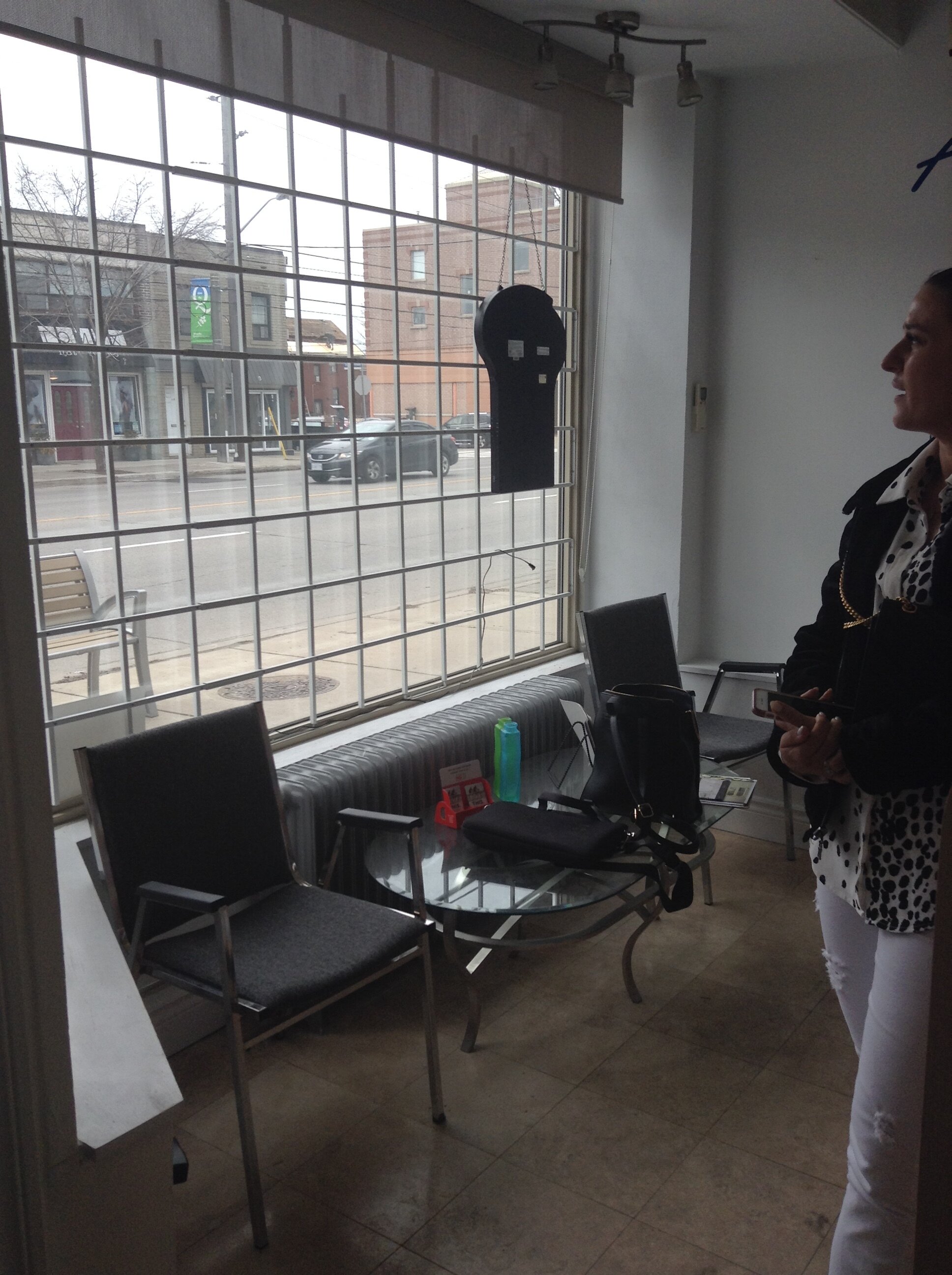
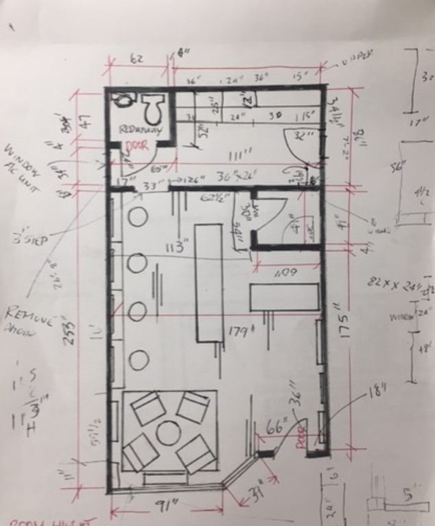
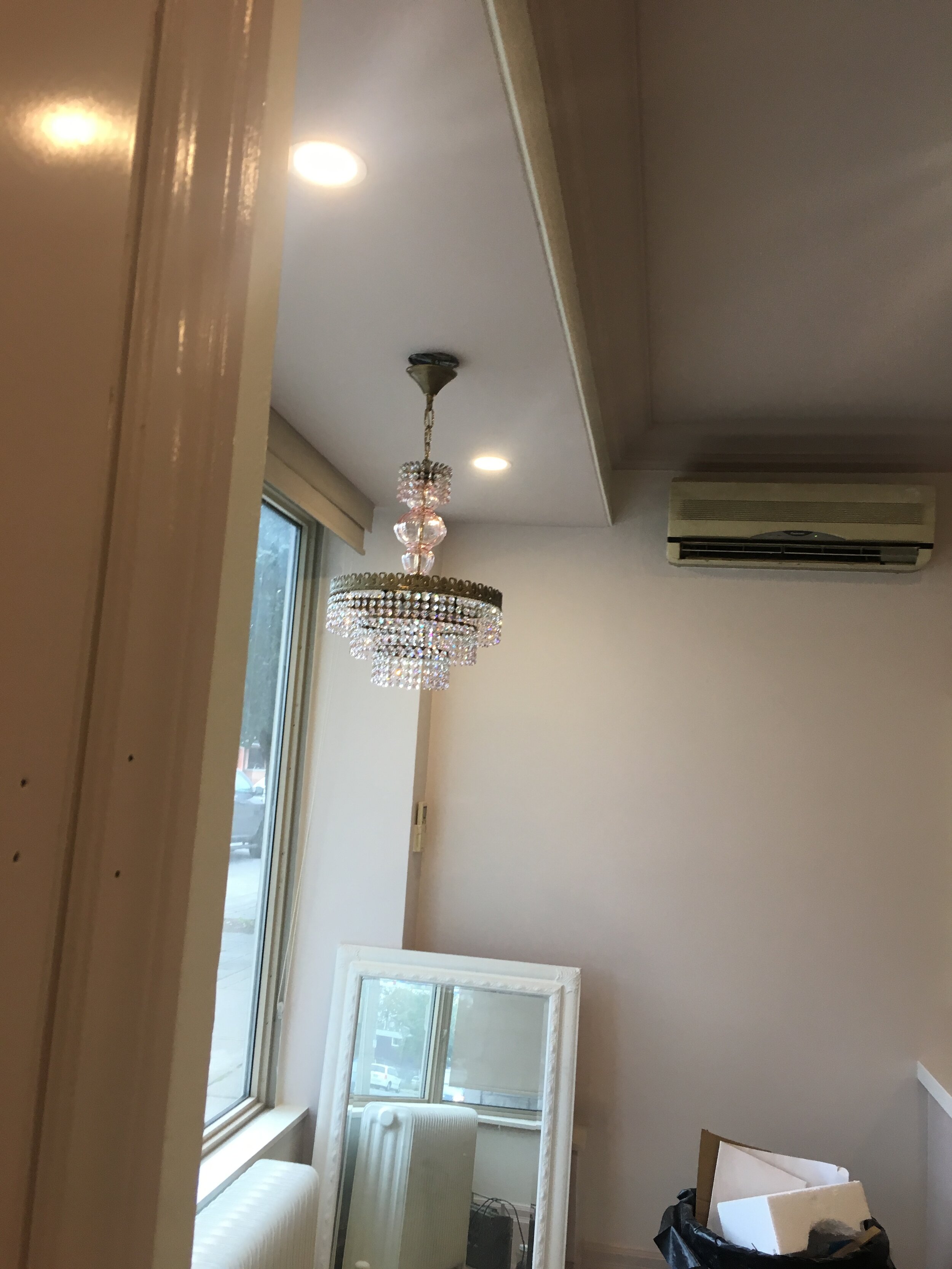
When Brittany first contacted she wanted to meet together to take a look at the space. At the time it was a pharmacy that wasn’t too pleasing to the eye. I took my measurements and told her what I visioned for the space. I asked what her must haves were and talked about a flow that would make the shop not only look beautiful but would be the most practical. Here are some of the before photos:
After the meeting I spent some time on the Fancy Face website and Instragram to really get a sense of their style and brand. Brittany mentioned to me in the meeting that she wanted a beautiful “Instagramable” space that was classic and had a wow factor. She talked about how she was inspired by more traditional design and loved a classic Perisan style. Hearing this was like music to my ears and I was excited to get some sketches and inspiration done.
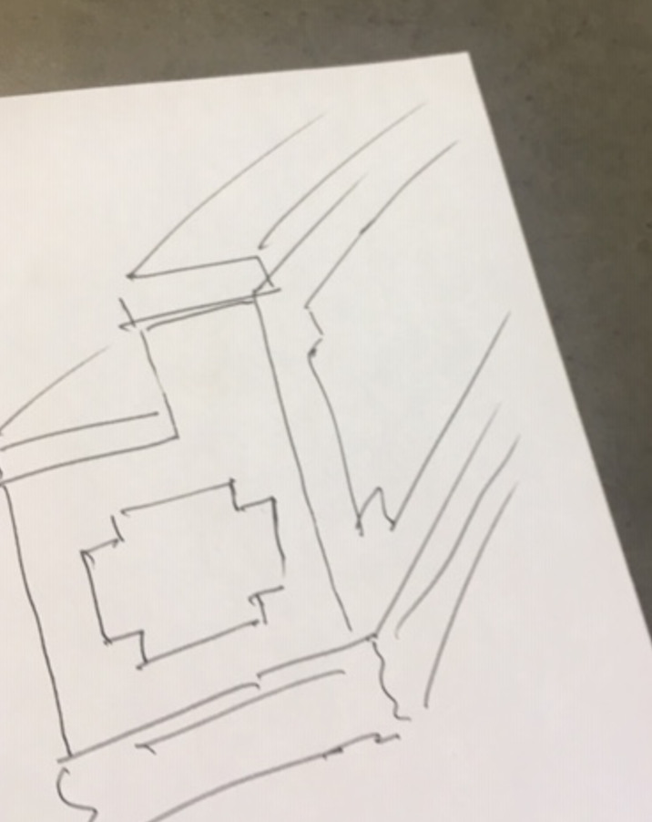
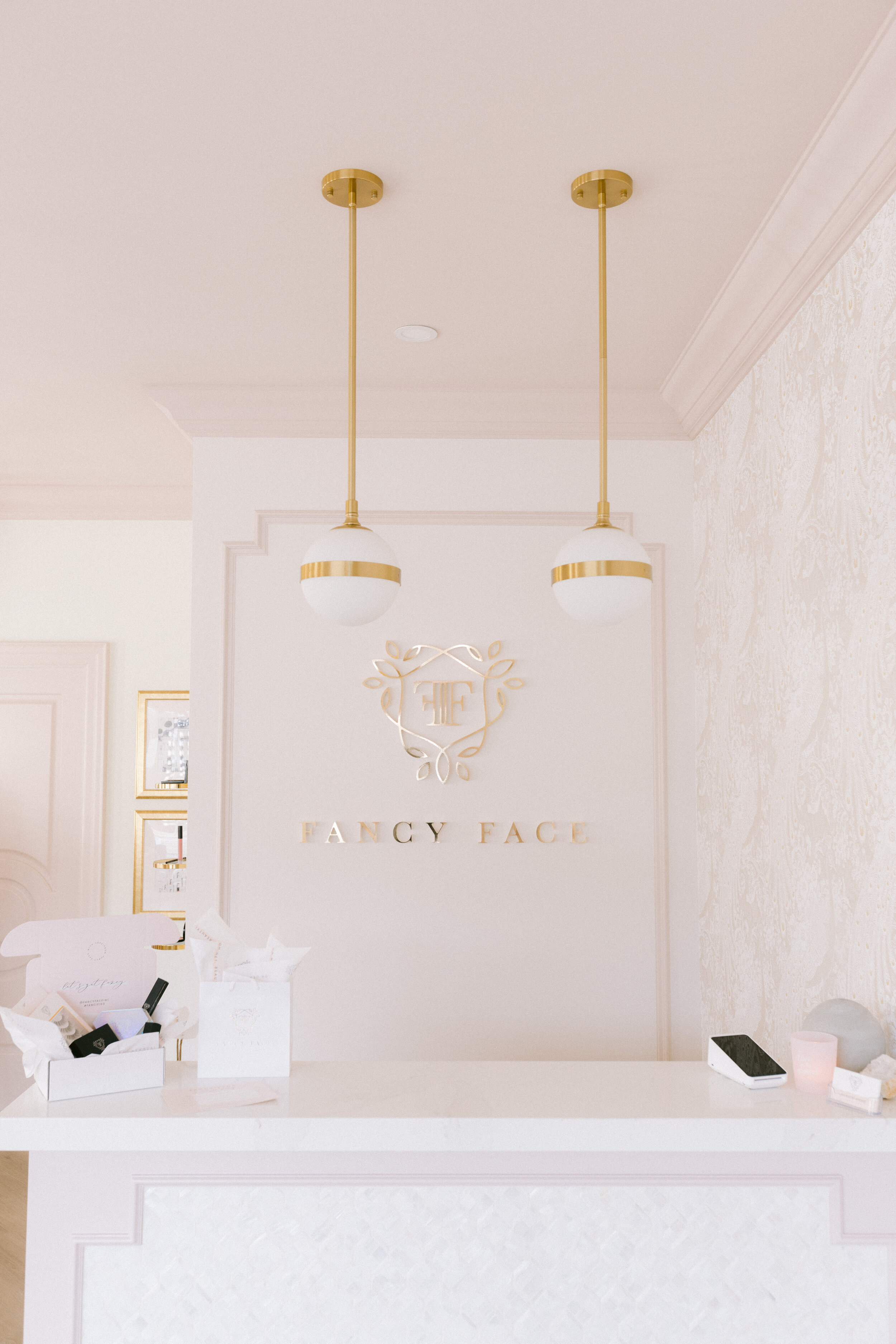
Looking back at these sketches I’ve realized that not much has changed. I loved the idea about having a front desk visual to the front door with the “Fancy "Face” logo and pendant lighting
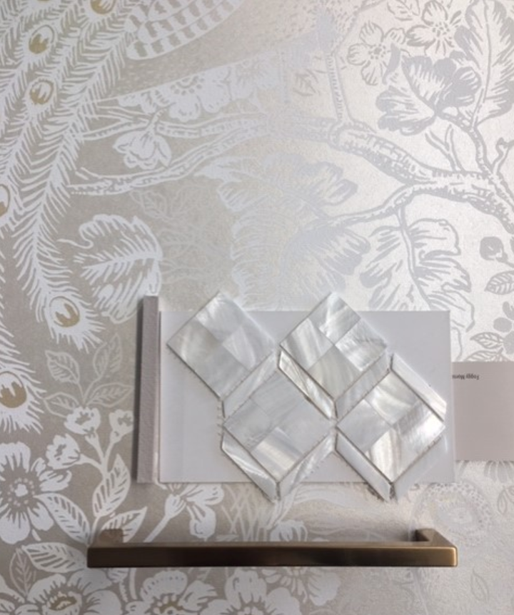
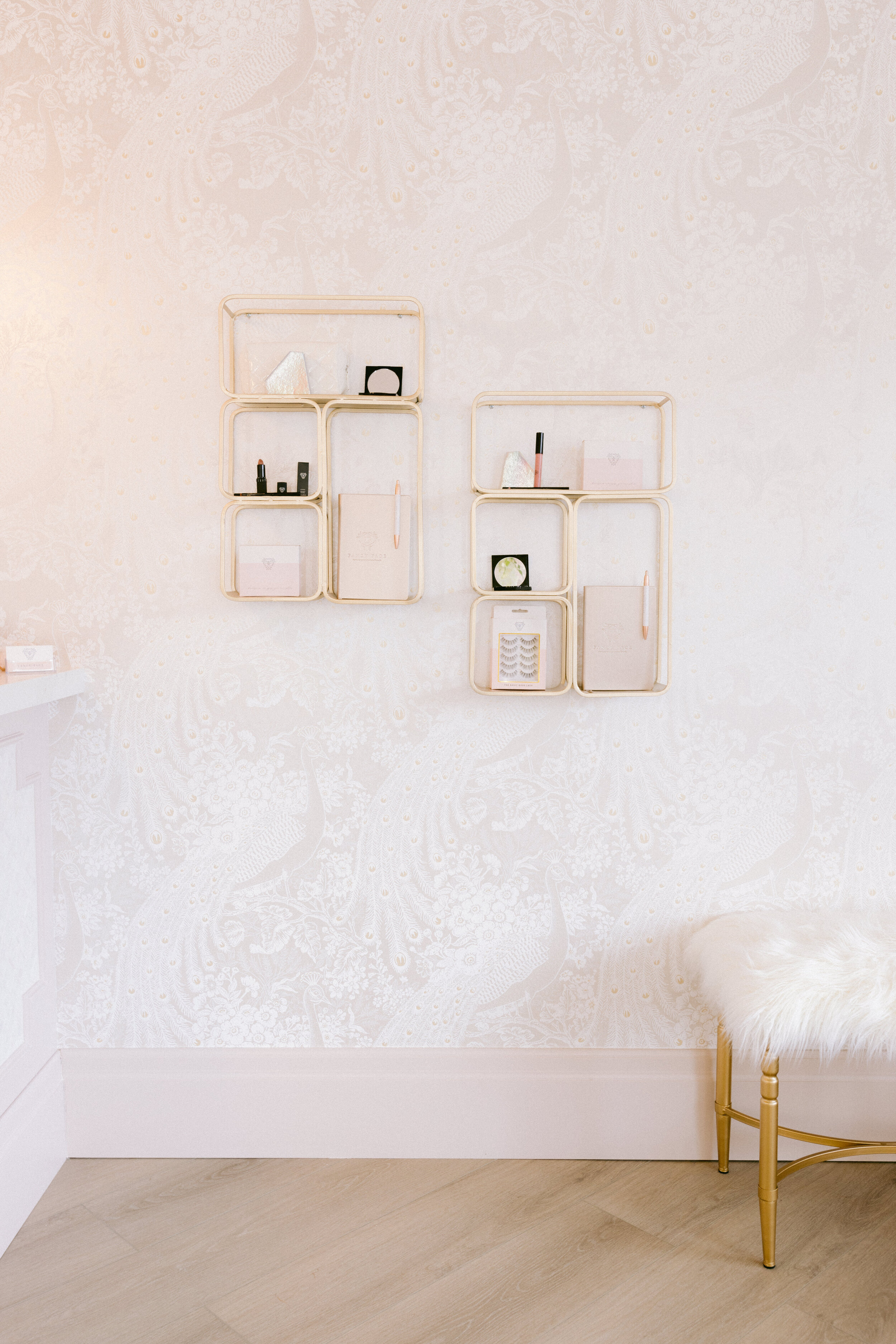
I had the idea for this wall to be wallpapered to add some interest to the space which is what we stuck with from the beginning.
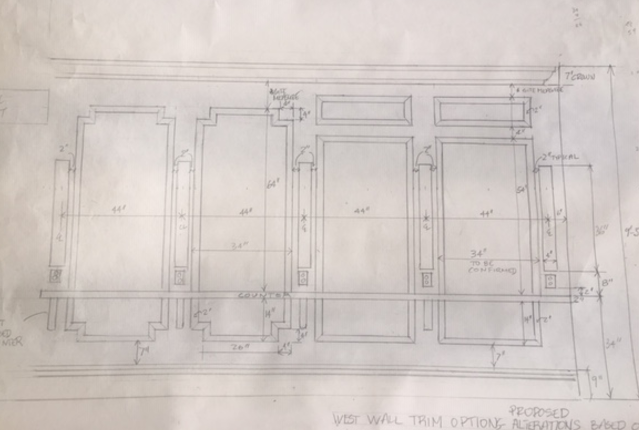
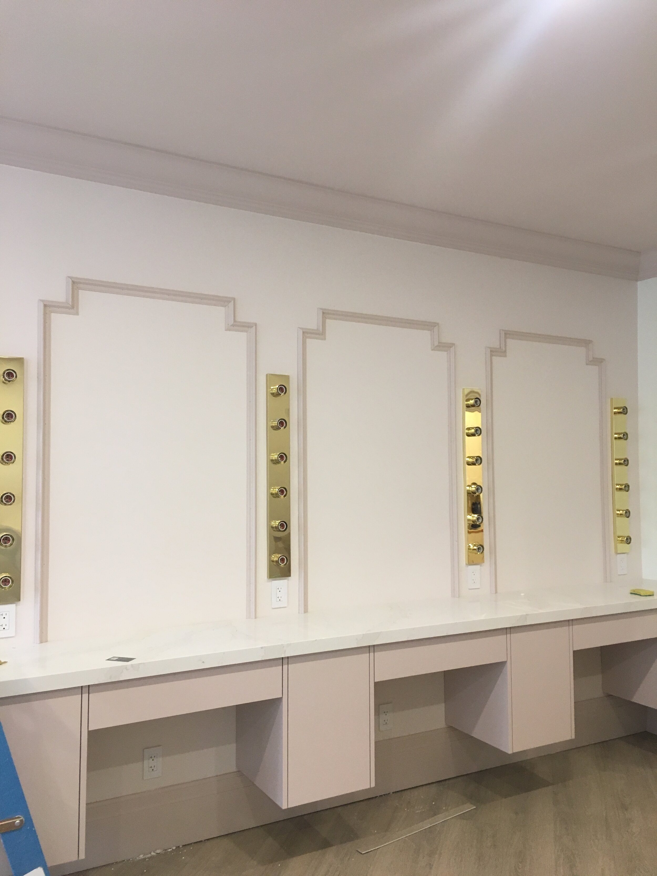
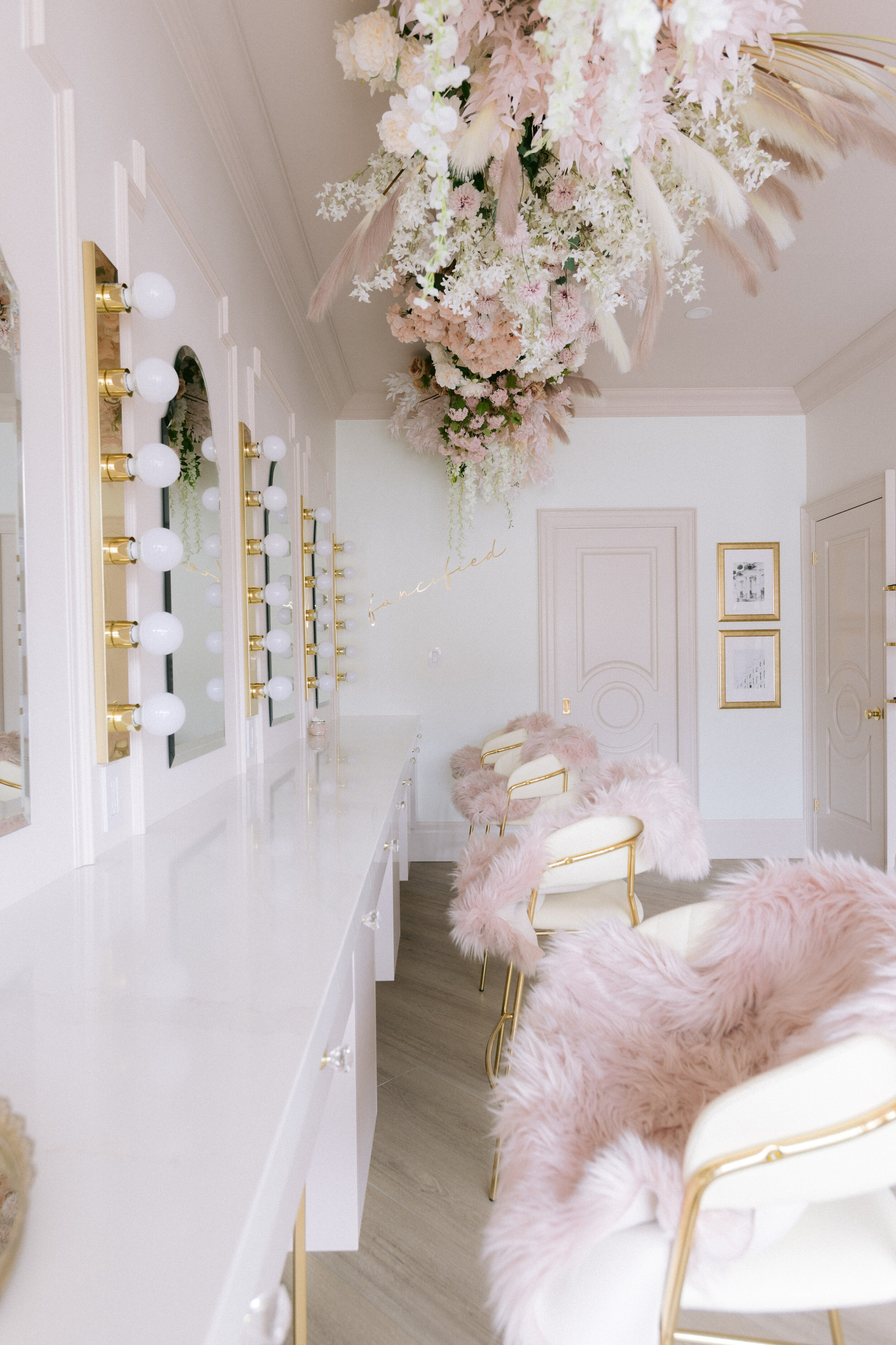
Brittany was adamant about having 4 makeup stations with enough room and surface space. In this original sketch I had the makeup stations with the custom trim around the mirrors to give that “vanity” feeling.
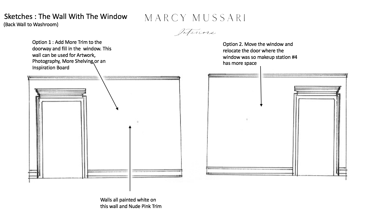
Before, the back wall had a doorway leading to the back and a small storage space. We decided that we wanted to keep the space for storage but wanted to move the placement of the doorway so that the makeup stations could have some more wall space and a better flow.
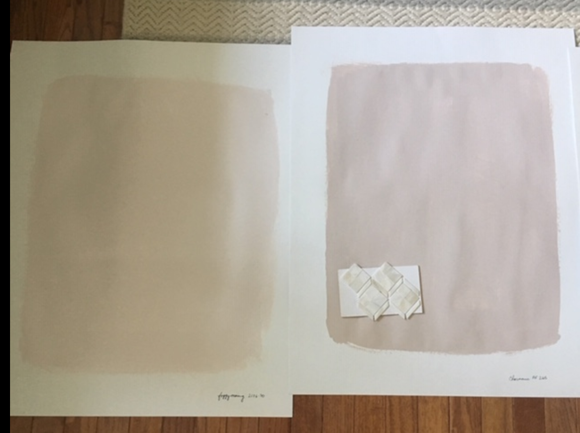
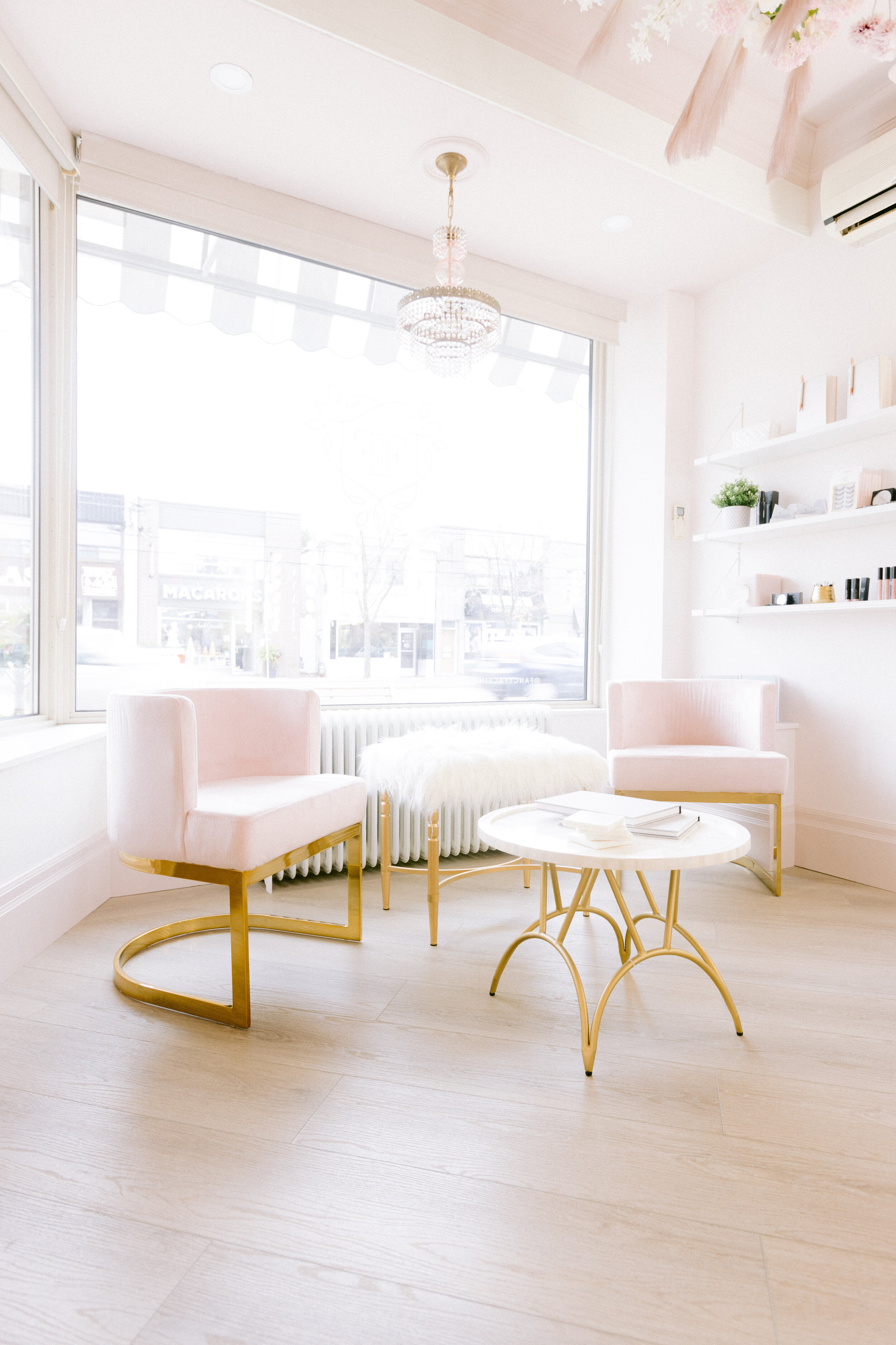
The colour pallet had stayed the same from the beginning. We loved the idea of a light and bright feminine space with neutral pinks. We were both on board for gold accents and pretty trim work as well.
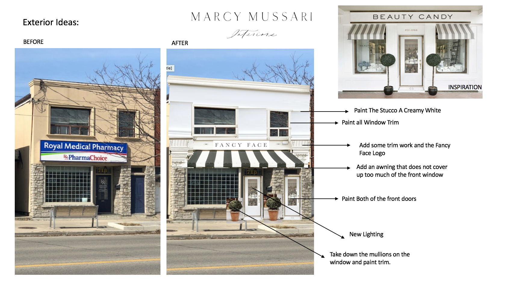
The inside of the space wasn’t the only thing in need of a face lift. We also needed to created a beautiful facade for the shop. I created a quick inspiration using ideas from Persian shops with creamy whites, a pink door and a striped awning
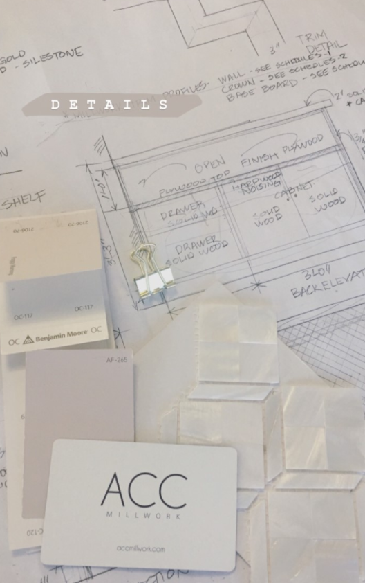
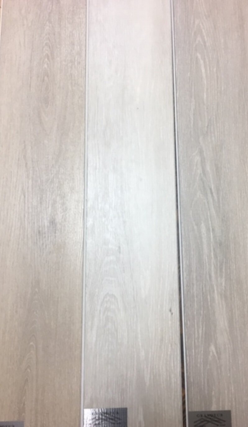
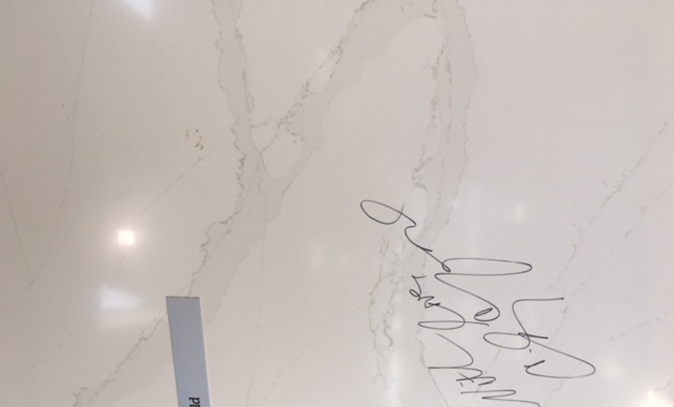
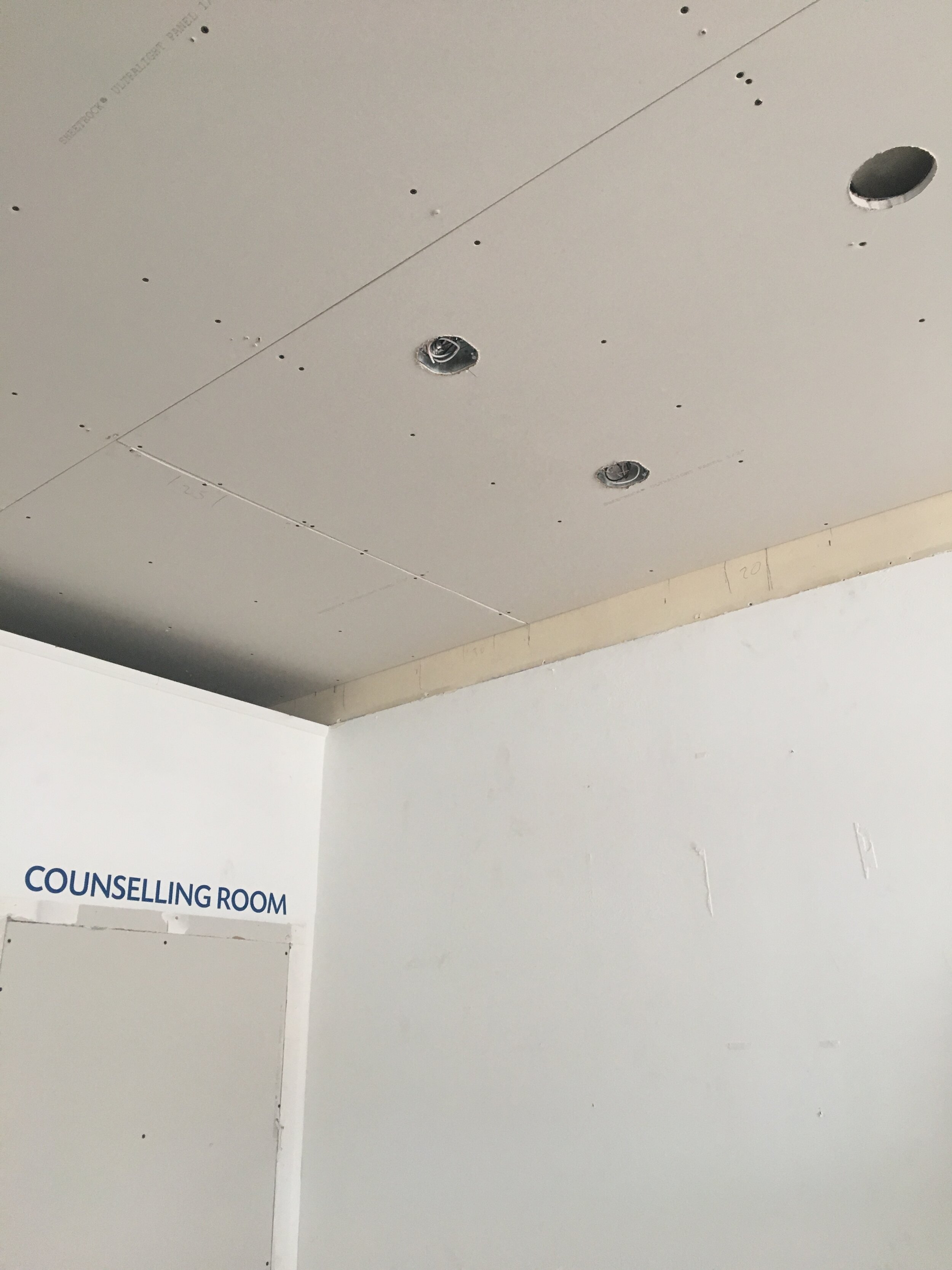
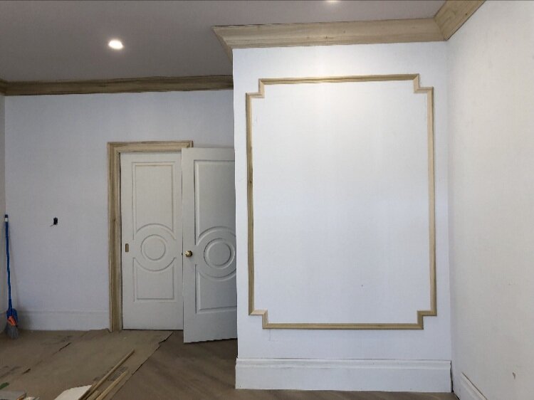
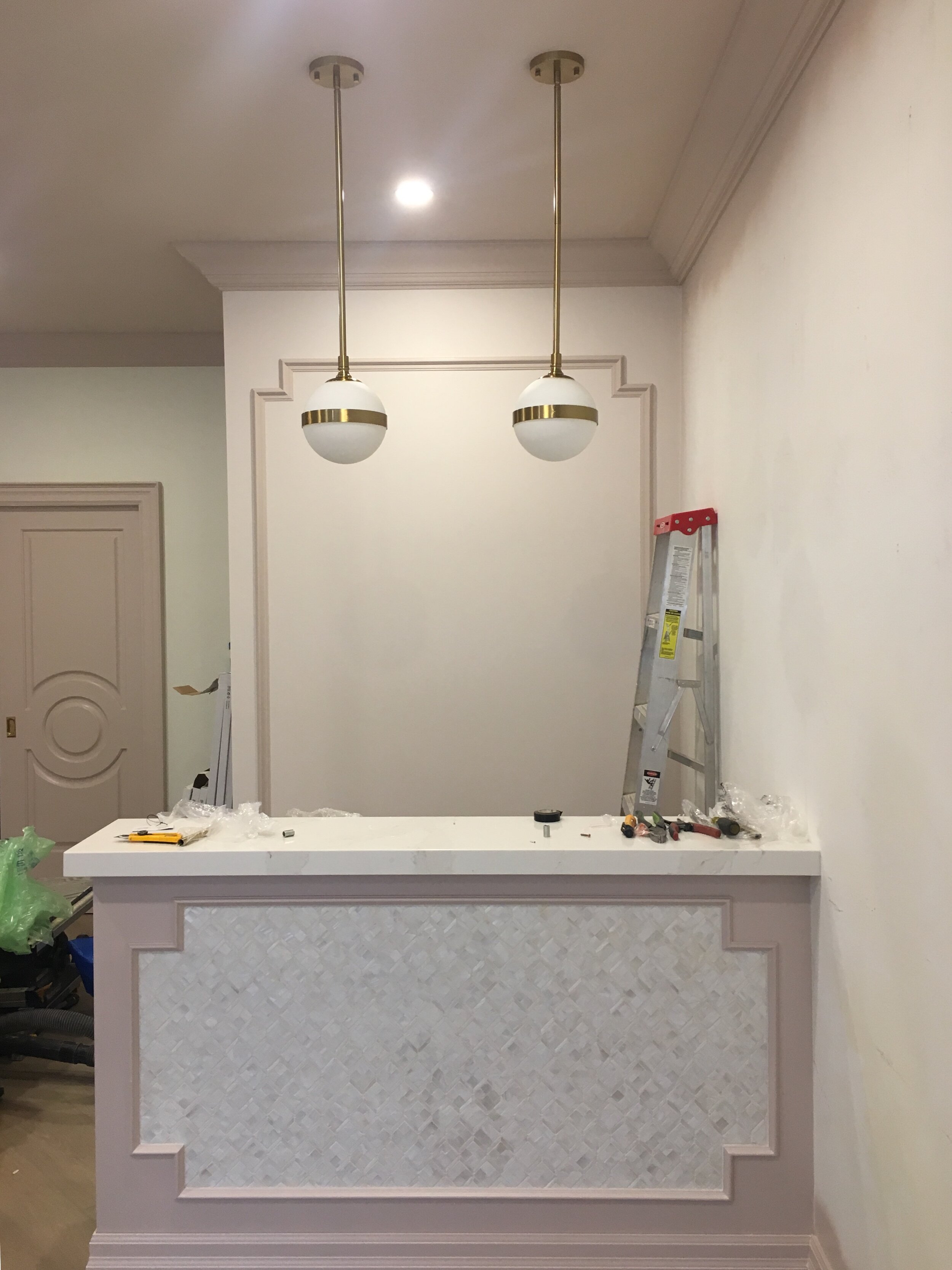
There were many choices to be made from which contractor to hire, finding the perfect pink colours, to what would be the best size for the front desk and makeup stations to the perfect flooring shade, wallpaper and lighting. The list goes on and on. I wanted to make sure that everything would complement each other while staying on budget. Here are some photos of the process:
It was alot of work and there were many decisions that needed to be made but from the beginning I stayed true to my initial plans and the clients needs.
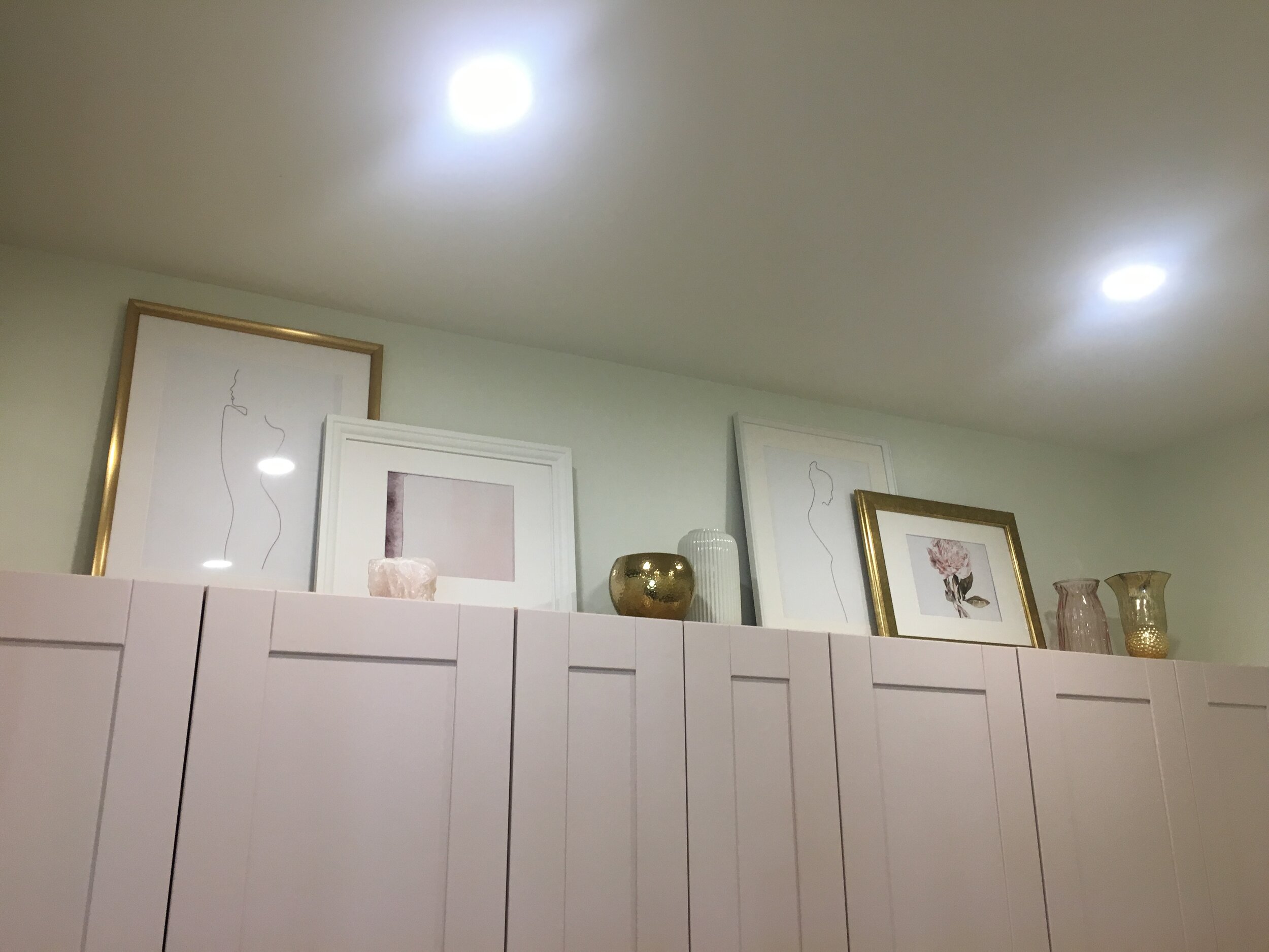
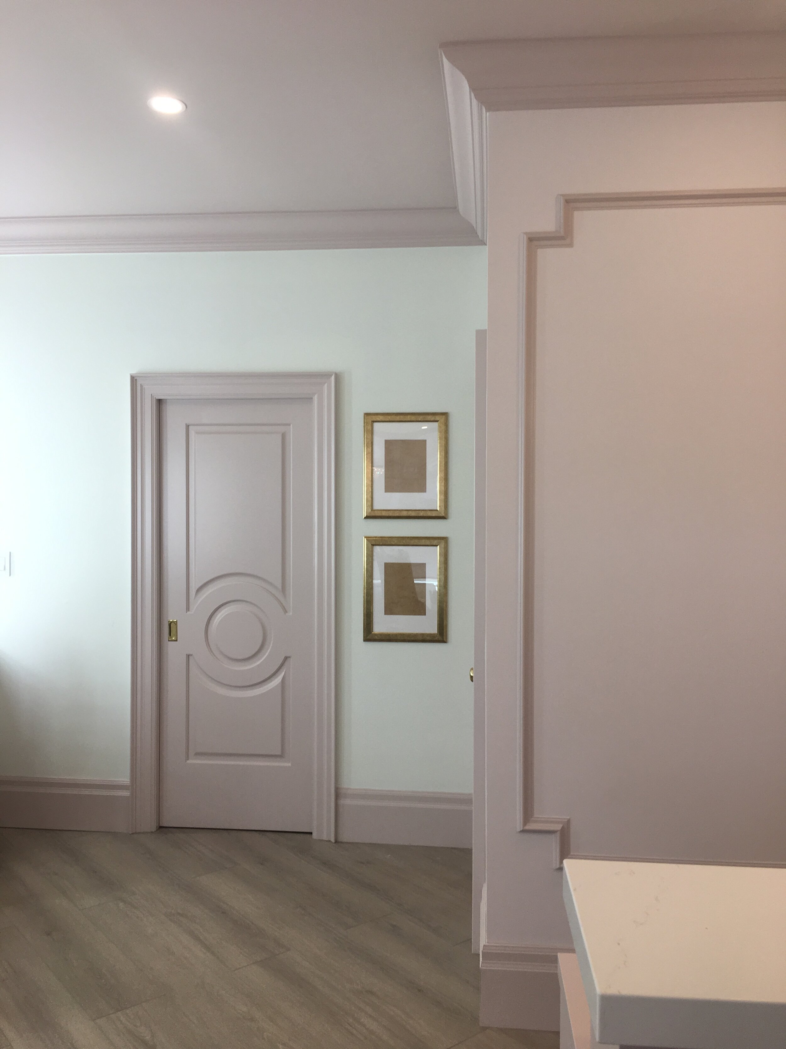
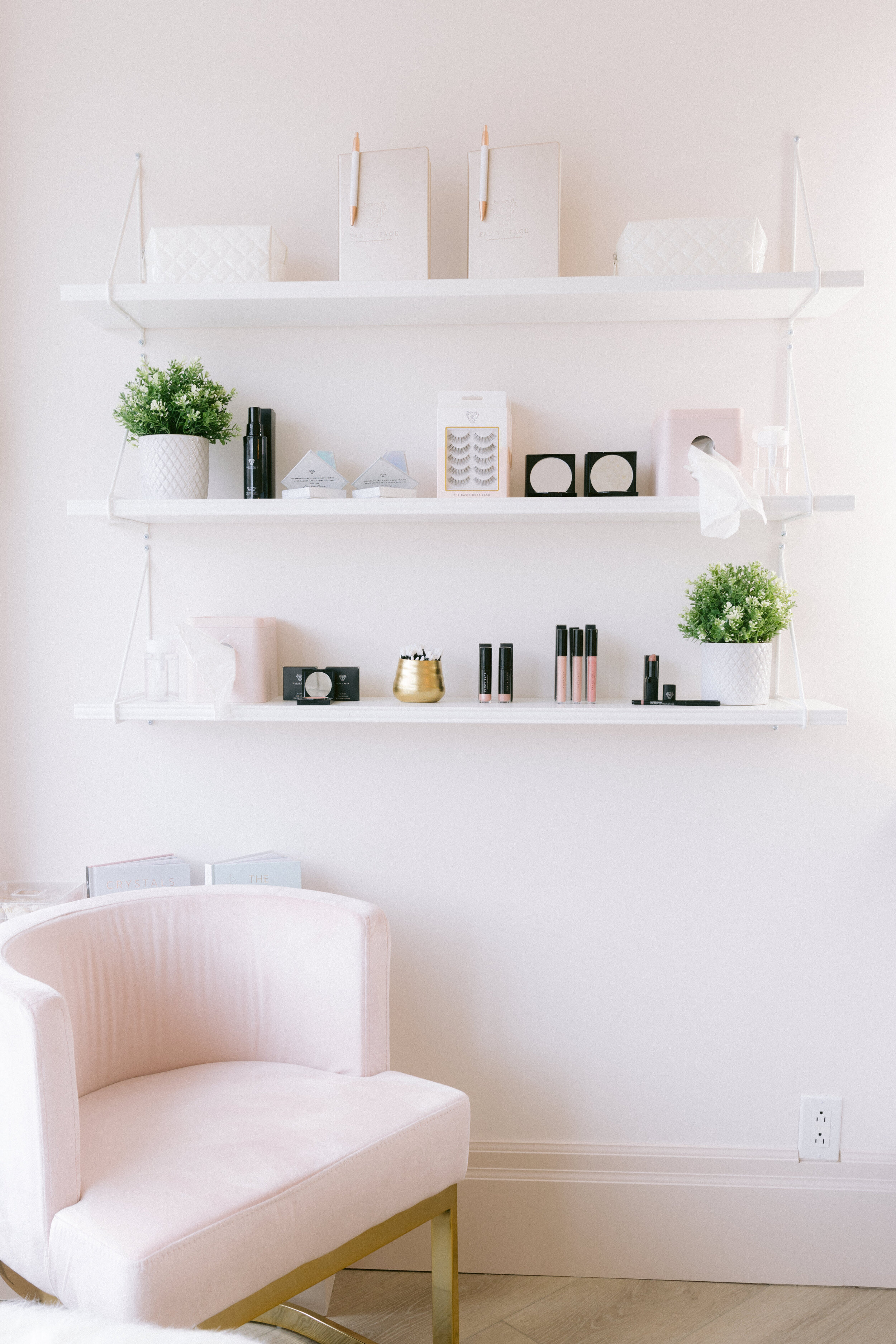
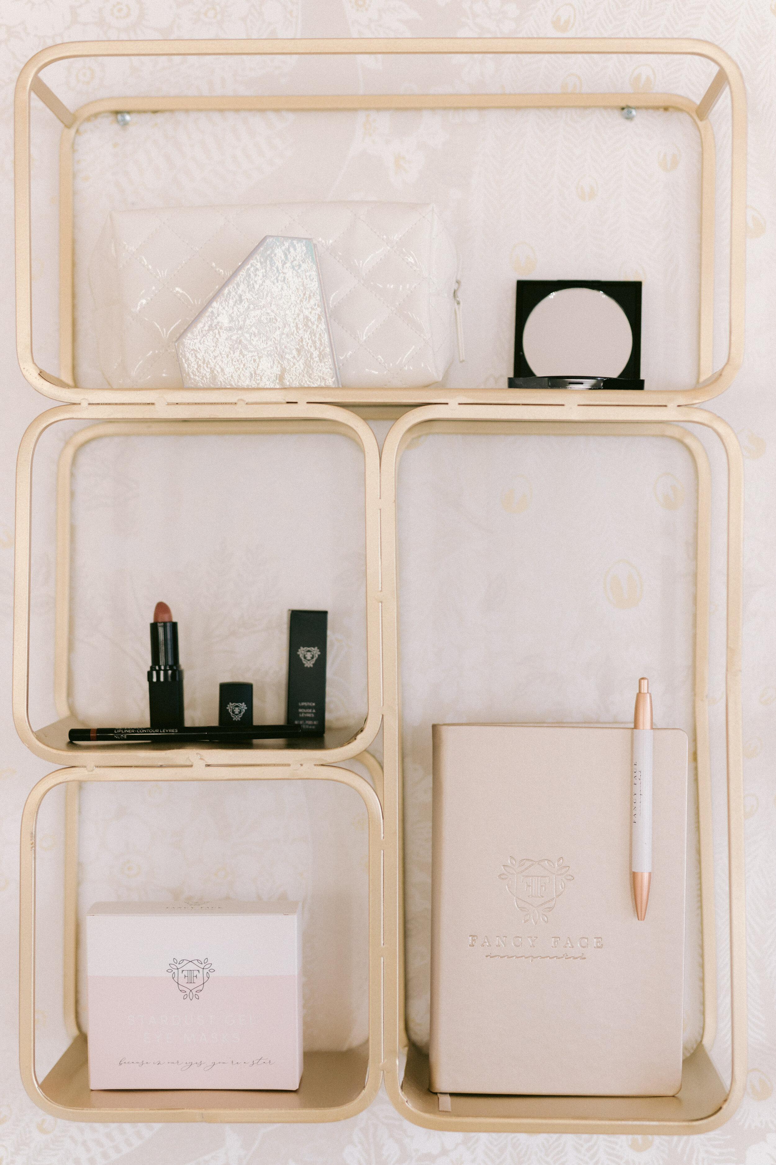
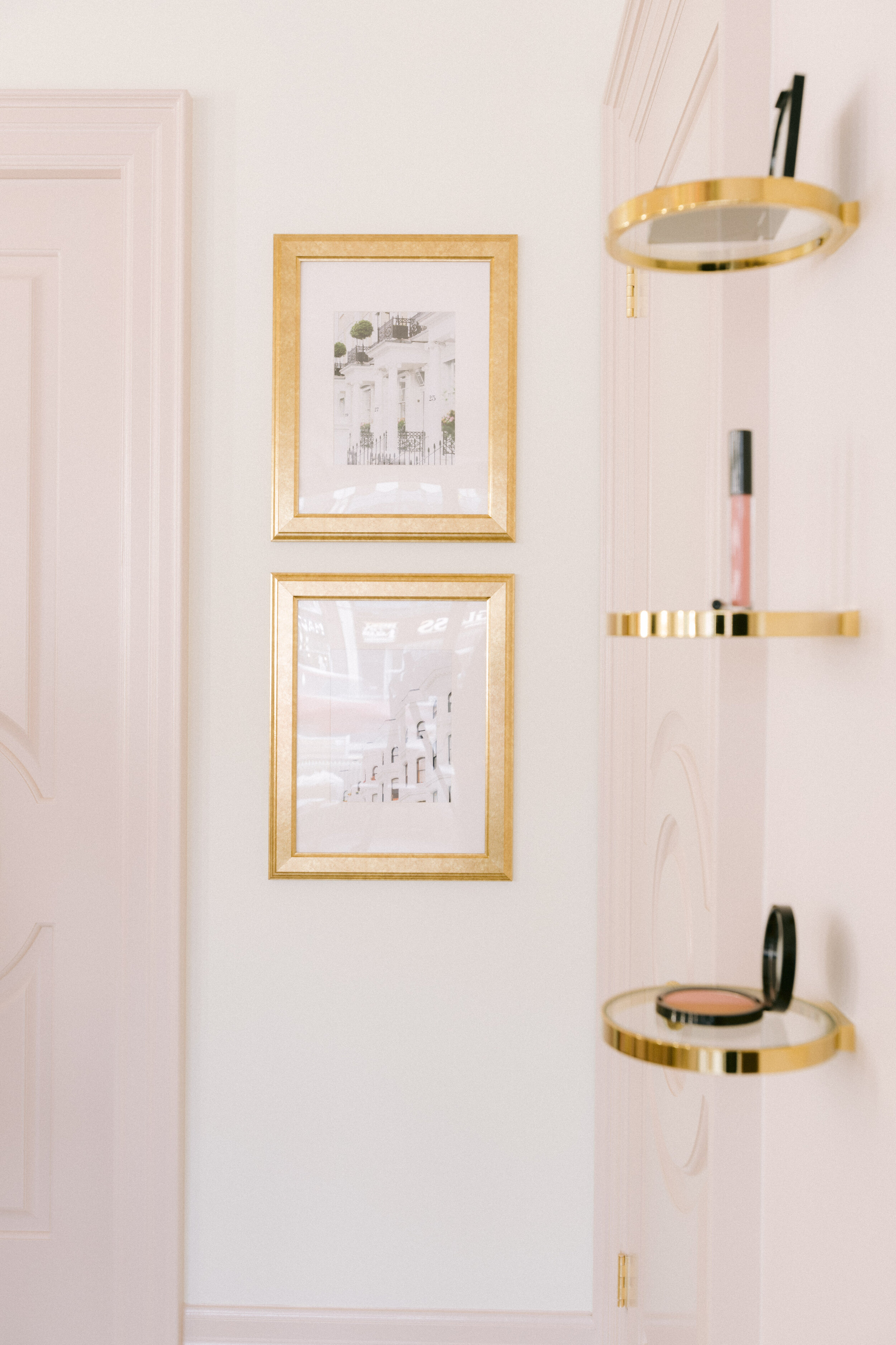
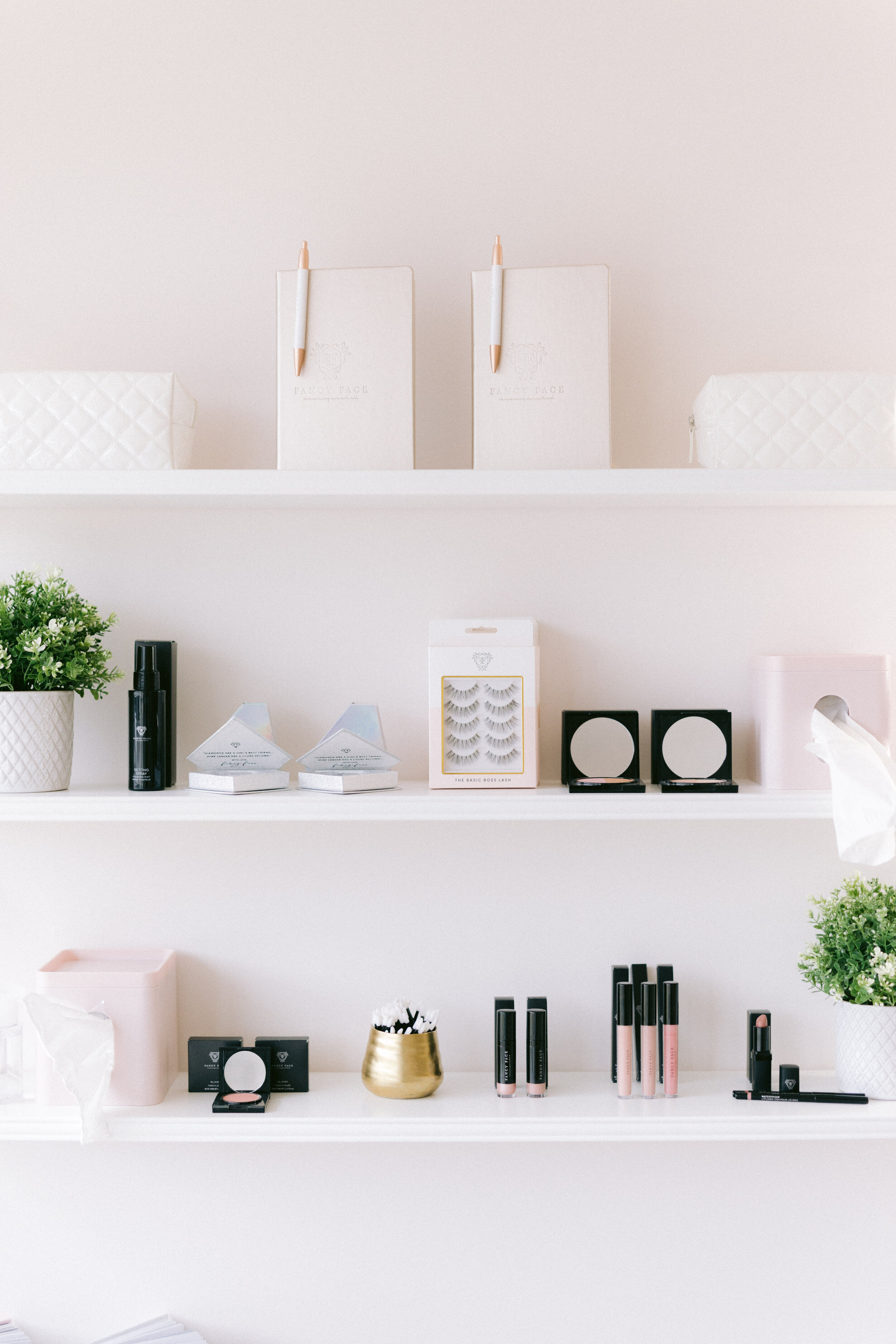
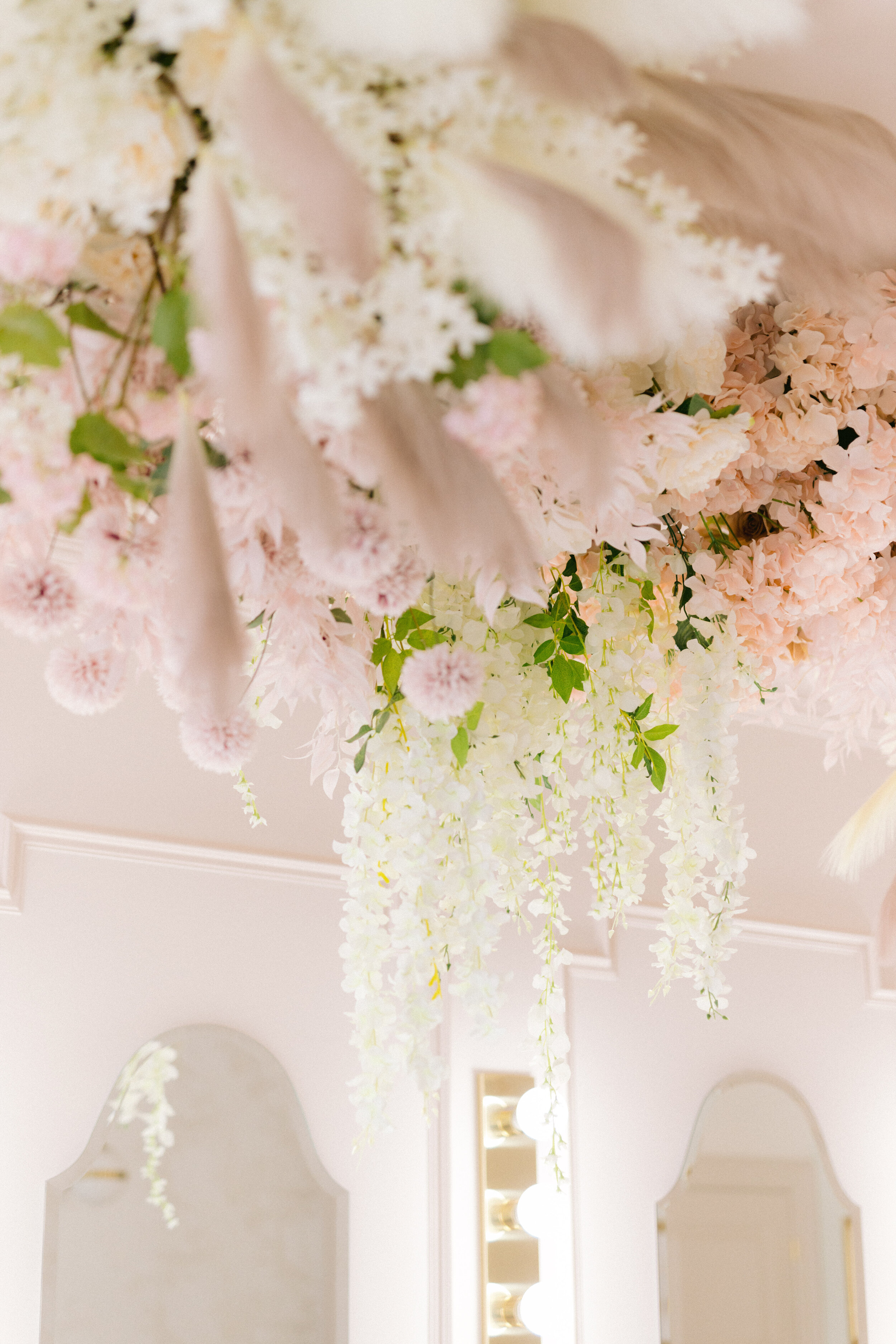
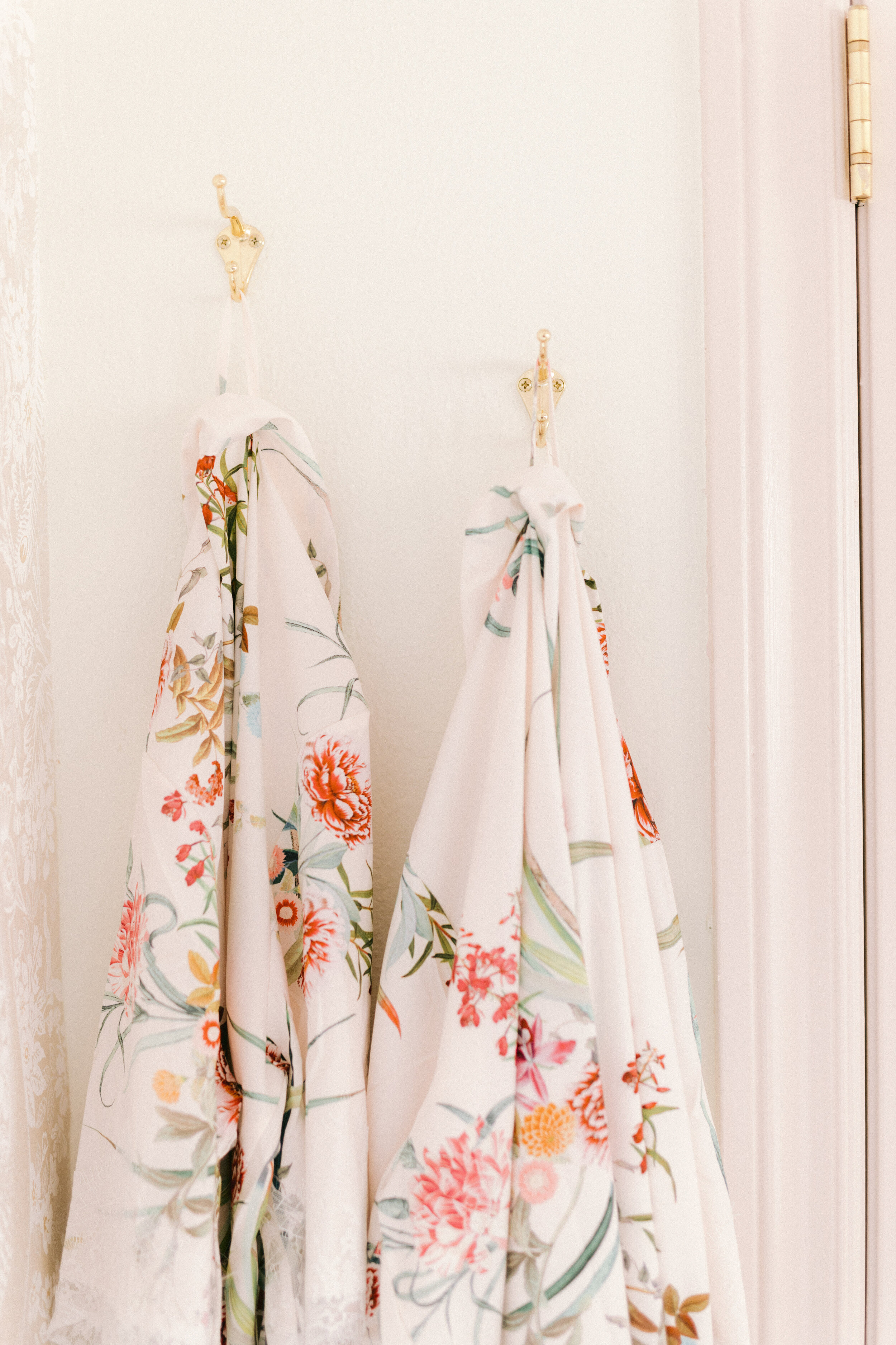
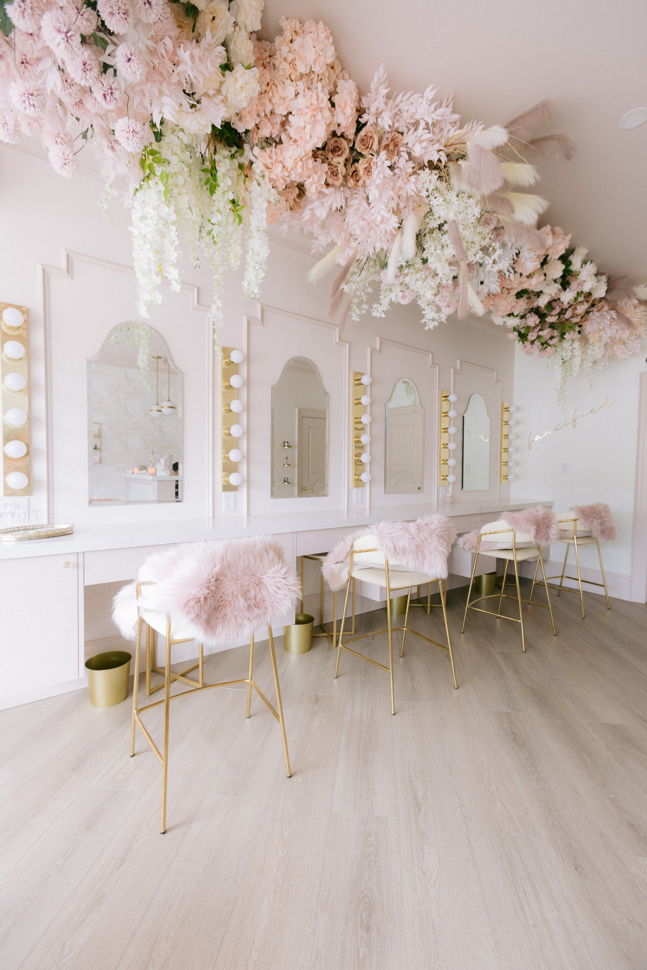
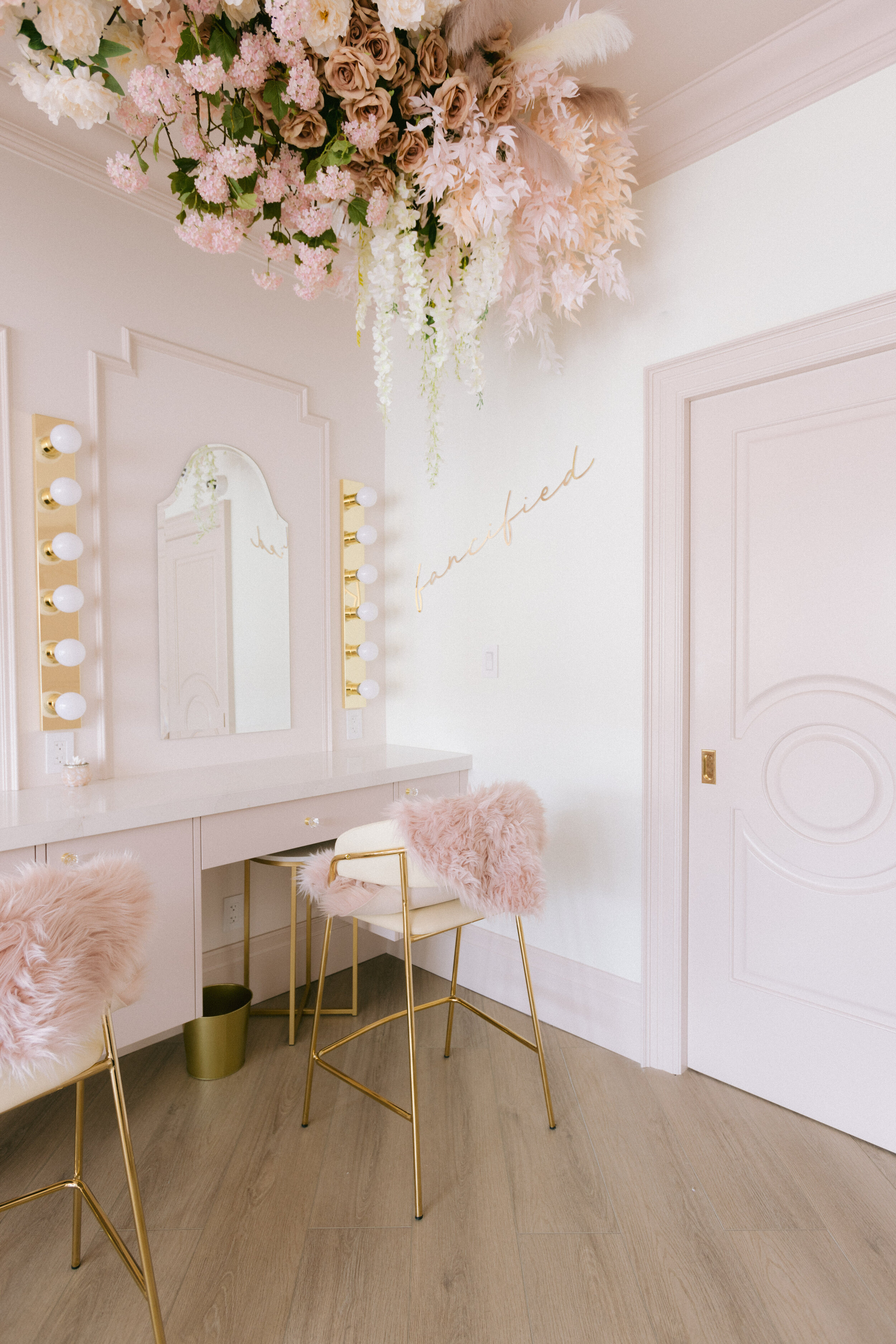
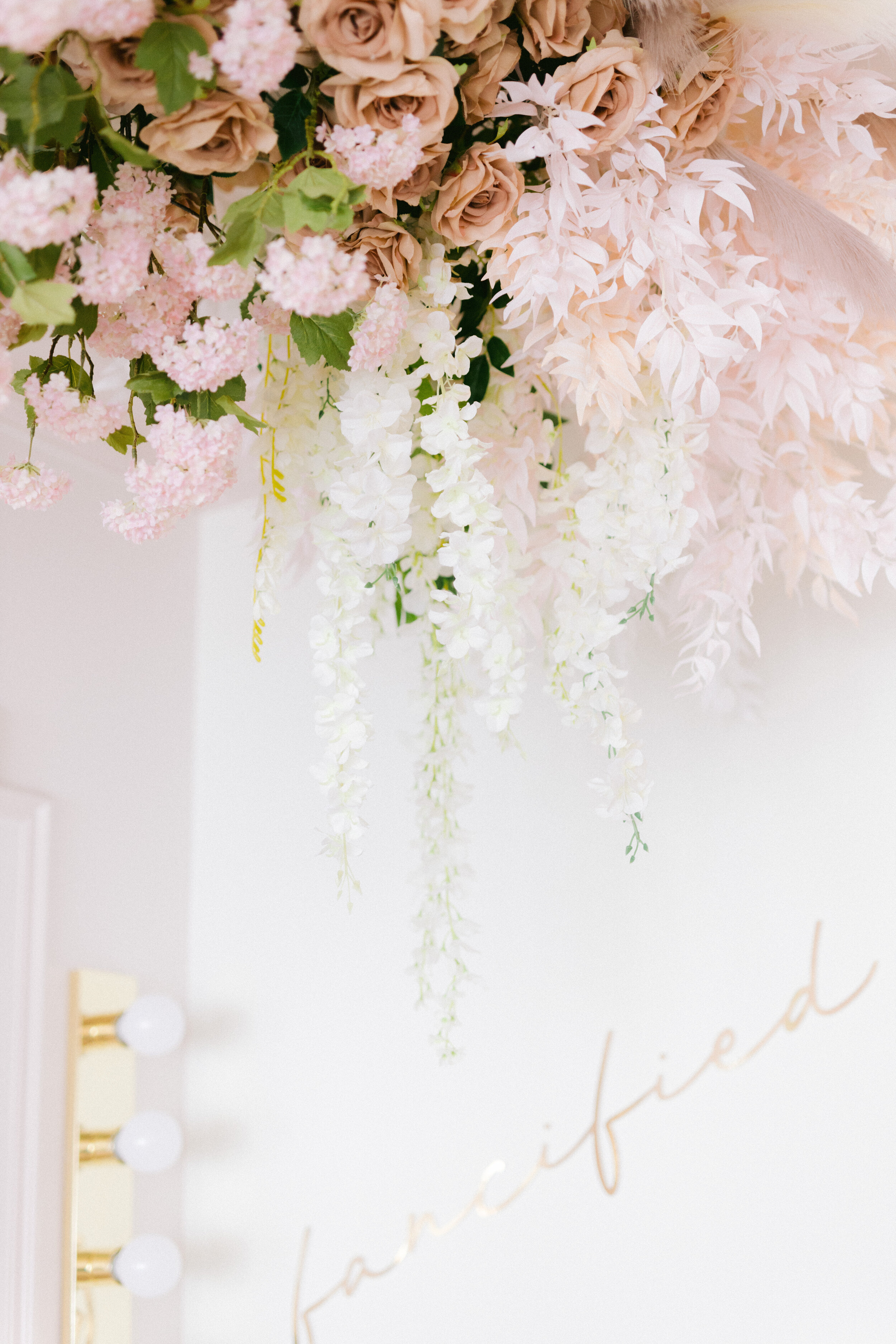
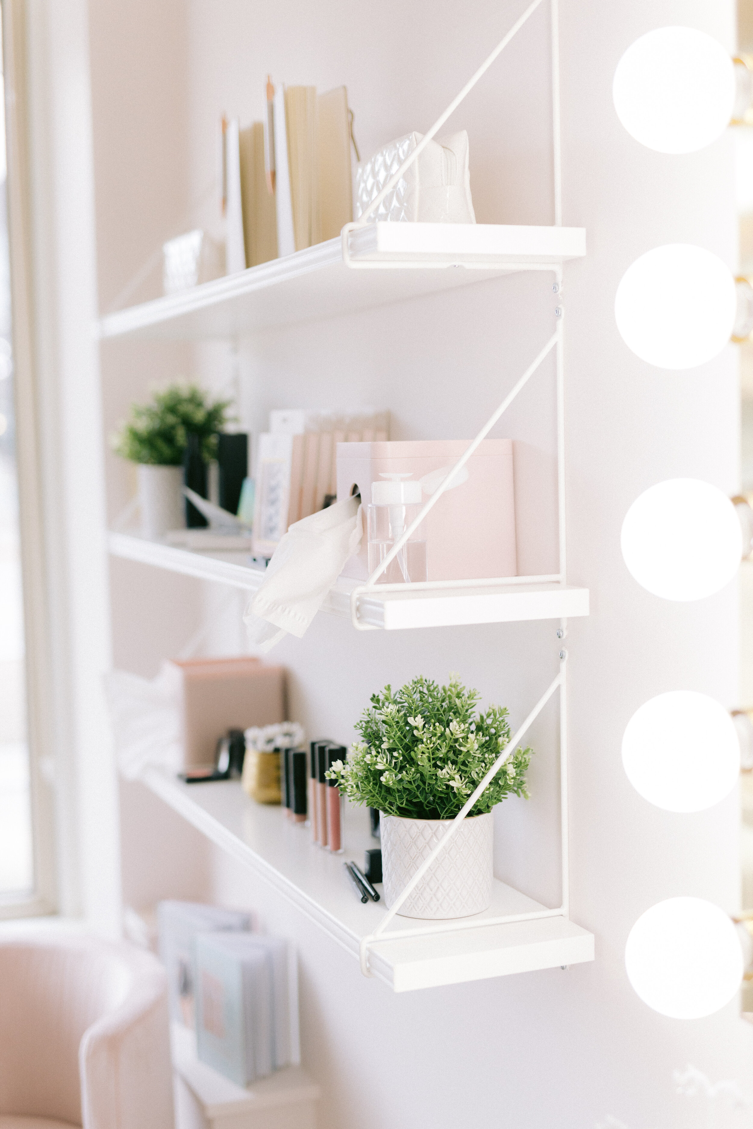
Check out these after photos of the magical “Rose Room”
This was one of the most rewarding design projects I have worked on so far in my career. I am so happy with the way this beautiful space came together!
Until Next Time,
Marcy, xo
